Home  Open Minds Are There Rules in Art?
| Are There Rules in Art? |
 |
 |
 |
| Written by Kurt F. J. Heinrich | |||||||||||||||
Are There Rules in Art?
How useful are rules in art? If it were a science, there would be fixed laws, as in physics and mathematics. If not, is it possible to set rules? Leonardo da Vinci says yes: “Truly this is science, the legitimate daughter of nature, because painting is born of (that) nature. “ And Leonardo gives us a lot of instructions and advice. But before we take them literally, we should consider what the meanings of the words art and science were at the time of Renaissance. The definition of art may have included any skill; those of science any kind of generalized knowledge. Leonardo speaks mainly of the physical and physiological aspects of painting, of perspective, color, light and shade, of anatomy and botanic, of proportions and movement, rather than of esthetic theory he talks of art as imitating nature Yet Leonardo, obviously, does not merely imitate nature. Neither should we. The concept of Nature, and of art as its imitation, was a novelty in his time. There was no concept of the freedom of the artist and of the diverse paths art can take.
Science, as we define it now, gives unique but provisional answers to problems. Unique because a physical phenomenon has, in principle, only one correct explanation; Provisional, because in physics, chemistry or biology new theories are continuously formed that replace previous ones. Art, instead of a single explanation, offers a selection of solutions for an esthetic problem. There is not one way only of doing things. Tradition and invention alter our ways of painting, but no one is forced to accept any precept or to join any movement. Suggestions can be given, but no absolute rules or canons. Art is, ultimately, a testimony to man’s freedom. Yet, there exists a common ground for the appreciation of art, beyond time and space. We are able to enjoy the beauty of the cave paintings of Lascaux and Altamira (Fig.1), of Egyptian sculpture, of the works of Leonardo, Rembrandt and Corot. How, if at all, we can approach beauty (excuse the obsolete concept) in our own work cannot be explained with simple words. As Cézanne said to an inquisitive visitor: “If I could say it, I would not have to paint it.”
Color:
Light is the part of electromagnetic radiation that is visible to our eyes. It covers a range of wavelengths, from violet to red, orange, yellow, green and blue. Black and white are not real colors in the physical sense. Black is the absence of light, and white a mixture of colored lights. Colors that when added produce white (e.g., green and red, yellow and violet, blue and orange) are called complementary.
Fig.1. Altamira cave painting.
The characteristics of a color are hue, saturation and brightness. Hue is the type of color: red, blue, etc. The saturation is the purity of the color, diminishing from the pure color to gray.
Light can come from objects that emit it, such as flames, the filaments of electric lamps, fluorescent bulbs, the stars or the sun, and from objects that receive light from another source and reflect it (including the sky and the moon). The colors of pigments result mainly from the absorption of certain components of the white light and reflection of the colors that were not absorbed.
Fig. 2 illustrates the effect of mixing colored lights (not pigments!). On the edge of the figure are the spectral colors from red to violet. A line between any two points on the edge shows the colors observed when mixing the pure colors. The lines between complementary colors pass through the white center. Given the shape of the color field, we can inscribe a triangle red-green-blue (Fig.3) that covers most (but not all) of the possible hues and saturations. The end points of this triangle indicate what we call the primary colors. By adding these three we can obtain practically all colors of the spectrum. We can verify this by looking with a magnifying glass at a TV screen in action. The graph represents hue (along the borders of the figure) and saturation (diminishing towards the figure center). To also include brightness, we have to create a three-dimensional figure, with an axis from white through gray to black (Fig. 4)
Fig. 2 Fig. 3
Fig. 4 Fig. 5
Given the continuity of the color spectrum, the choice of primaries is somewhat arbitrary. From the point of view of color perception, there are four basic colors, red, yellow, green and blue. Black and white are usually added, and other colors (e.g. orange, brown, purple) are mixtures of these six.
The curve inside the diagram of Fig. 5 shows the location of the colors of hot objects, starting with red and moving towards white with increasing temperature. For this reason we call them warm, and this analogy is very good. A painting, with its border and frame, is like a room; although parts of it may hotter or colder, it has usually a predominant temperature, related to the color of the illumination (and the mood of the painter). See figs. 6 and 7.
.
Fig. 6 (Degas)
The landscape by Degas (Fig. 6) is limited in the range of hues and brightness; yet is has beautiful colors and a warm atmosphere. The Cézanne landscape (Fig. 7) in turn, is painted in cool tones.
The perceived hue, saturation and brightness of a color are affected by adjacent colors. If surrounded by dark it appears to be brighter, if by warm colors, cooler, etc. Rudolf Arnheim (Art and Visual Perception, U. of Cal. Press, 1974, p.369) believes that the pure colors are neither warm or cold, but that warm or cold colors result from adding other colors to the primaries: red plus a bit of yellow is warm, with a bit of blue it is cool. One could also argue that the concept of warm/cold is due to deviations from an expected local color, which can be attributed to the source of light. (Or the painter’s mood).
Fig. 7 (Cézanne)
Pigments.
The pigments we use in painting absorb a wavelength range of the light that enters them, and reemit the remainder. Let us assume that a certain pigment receives white light that contains the full color spectrum, and that it absorbs light in the color range marked with the white arc on Fig. 8. The color of the light it emits then changes as indicated by the arrow. A pigment absorbing blue light will therefore emit the complementary color, which is orange. The exact effects of mixing pigments must be determined by experimentation, but the color of the resulting mixture is that which results from the absorptions by its components. The ‘primaries’ for the palette of pigments are therefore the complementaries of red, blue and green, that is, cyan (blue-green), yellow and magenta (Fig. 9, right). These are the ones used in color printing.
As we mix pigments, the saturation diminishes, and so does the brightness. A mixture of the three primaries gives black. If we wish to increase the brightness of a mixture, we must add white pigment (or, in transparent watercolor, let the white paper shine through). The colors of pigments are not fully saturated and our palette would be incomplete if we were to use three primaries and white only. But black can be approximated quite well by mixing pigments (for instance, alizarin red, cadmium yellow and ultramarine blue). Such mixtures, which still may conserve some tinge other than pure black, are often preferable to the pure black that comes in the tubes.
Fig. 8
Fig. 9
Since simplification is part of the artistic process, we usually chose a relatively small range from the thousands of colors that are available. Our first instinct is to apply to depicted objects their object, or local, colors. But the perceived colors depend also on the illuminating light. (Fig.10).
Fig. 10 Fig. 11. (Bonnard)
Features that contrast in color or in brightness with their surroundings attract our attention. Complementary colors are often used, such as the orange of the tower, figure 7.
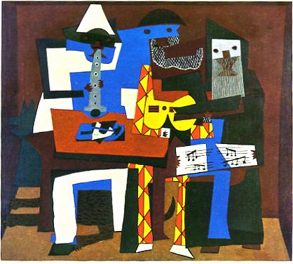
Two colors only are often sufficient for the desired effect (Bonnard, Fig. 11. Usually one color is dominant due to its area, central position, or saturation. When the contrast in the picture is mainly one of brightness, a very narrow range of colors can be used successfully, (Fig.12). On the other extreme, strong color contrasts can be used when the colors are applied flat (Fig. 13). To emphasize emotional aspects, we can freely change colors as well as shapes. From the expressionists onward, colors have been chosen frequently for emotional value (Fig. 14).
Fig. 12 Fig. 13
The contrasts of hue and saturation may vary greatly from one picture to another, but all paintings show contrast of light and dark; even the pure saturated colors cover a range of brightness, from yellow to deep blue and violet, as can be seen on a grayscale reproduction of the color triangle (Fig. 15).
Drawing:
We must be able to draw correctly the contours or anything we paint. Drawing is important even if we do not intend photographic accuracy: we must be able to put on paper or canvas whatever we intend to be there.
Try omitting the unnecessary, simplifying, repeating effects, restricting colors, and/or limiting contrast. Make a portrait or figure with a minimum of brushstrokes, ( Fig.16)
Geometrical Perspective.
Geometrical perspective creates a realistic three-dimensional view on a two-dimensional plane. It is said to have been invented at the time of renaissance. However, perspective was discovered rather than invented, since perspective is due to the fact that the apparent size of objects diminishes with their distance from the observer.
Horizontal parallel lines such as borders of a road or the top and bottom of a wall converge at a point at the horizon. All objects situated above the level of our eyes are seen above the horizon, and those below it are below the horizon. (fig. 17)
Fig. 17
The green and yellow lines connect at the horizon, (red) which marks the eye level of the observer.
Fig. 18 illustrates the effects of perspective on a set of shelves, and one of horizontal circles, at various heights. The uppermost shelve and circle are seen from below. The black circle indicates the height of the Horizon.
Ever since Cézanne, painters have ignored or stretched the rules of perspective, stressing the flatness of the canvas, and so can we (Fig. 19). Still, when we paint a landscape, we include or imply a horizon. Where should we put it? Of the three seascapes (after Canaletto) on fig. 20, the middle one is the least interesting. It is not usually best not to divide a picture by the middle into sets of equal size. (See, however, Fig, 7!)
. Fig, 18
The golden rule is often cited as a prescription for harmonious size relations in a picture. If a length is to be divided into two segments, or a rectangle is defined by the length of its height and width, the ratio of the larger segment or side to the smaller one should be equal to the ratio of the sum of both to the larger fragment or side. This ratio turns out to be about equal to 1.6. Measurements of the height and width of common commercial canvases show that they have ratios close to this number. In fig. 20, the ratios of the total height to the mayor field are 1.4 for the upper and lower picture, and 2.0 for the middle, which is less satisfactory. In fig. 21, the ratio of height to width is also 1.4. While we should not worry too much about these numbers, it is advisable that lines and areas should not be divided into two equal parts.
Fig 20 (fragments from a painting of Canaletto).
Fig. 21 (Leonardo da Vinci)
This beautiful portrait by Leonardo da Vinci of Emilia Gallerani, mistress of Lodovico Sforza, is painted with a limited set of colors. The contours are simplified to elegant arcs, and a drop shape is used repeatedly in the construction of the painting. (Fig. 22). The black hair band on the forehead is seen as a straight line; it is at the eye level of the painter. The ermine has symbolic connotations, which, however, seem to be controversial.
Fig. 22
Aerial Perspective:
Painting is presenting a three-dimensional space on a two-dimensional surface. In realistic painting, one creates the impression of depth, both by the design (geometrical perspective) and by the choice of colors.
Due to the greater absorption of warm colors in the air, distant parts of a landscape appear cooler than the foreground; they show less contrast and less saturation. The green leaves of the tree in the foreground of fig. 10 are painted a yellowish brown, in order to keep the foreground warm. Against the warm brown of the soil, the leaves still are cooler. The green color was treated in landscape painting with great caution.
Aerial perspective does not apply to portrait or still-life painting, since the absorption of warm light takes place over large distances only. However, even in these genres, objects closer to the painter (e.g. hands or feet) are often painted larger than natural. ( Fig. 23). This not only gives an impression of close distance, but it has also emotional implications.
Unity:
If the artwork were merely an imitation of nature, the best painters would all paint alike, and we could not recognize at a glance the paintings of our favorite. But a painting is not merely a report on nature. It is a representation of a perceived or invented order. (Cézanne said that he was seeking to paint something ‘parallel to nature’, and Klee: ‘ I do not paint the visible; I paint the invisible’. Zola referred to painting as ‘ nature seen through a temperament’.). The painting, surrounded by a conspicuous frame, is analogous to the scenario on which a drama is presented. And like a scene at the theatre, it must exhibit a logical and artistic coherence. This need for order distinguishes it from a casually chosen slice of our surroundings.
Fig. 24 (KH). This landscape consists exclusively of wedges of similar shape.
.What lends coherence and order to a painting? Besides the considerations of color we have discussed, the following elements help to unify a painting: the kind of brushstrokes, the repetition of shapes of lines and forms (figs20-22, 25), a wekk-defined direction of illumination (fig. 21), and a harmonious arrangement of the components (good composition).
Fig. 25 (Li K’é-jan)
A discernible direction of the illumination was introduced (reinvented?) in the Renaissance, and again neglected after the arrival of impressionism.
Composition:
How are the parts of a painting organized? Practically all paintings have areas (not necessarily objects) that, for their brightness, shape or color, attract our attention (figs. 26, 27). Like the parts of a mobile, these areas must be carefully balanced. But a moving object such as a horse or a bird is not in equilibrium: it moves into the space before him, and leaves the past behind (fig. 24), even before it has taken to flight (fig. 29)
Fig, 26. The prominent features of figs. 20 and 21
In the classical portrait, the person to be depicted was placed in the center of the picture. In a more expressive mode, she may also claim the space in front of her, into which she looks, and may perhaps move later (fig. 30). The figure, as a rule, looks into the center. In the painting of a group, (fig. 31) most persons do so as well. But if a person is offset and looks in the outward direction, a strong imbalance and tension arise. In fig.32, the model, which happened to be blind, is seated facing the wall, close to the picture corner. This strong centrifugal element is opposed by the figure at the right side of a painter in front of her easel. Although small, this figure contrasts strongly with her surroundings, is located right at the border, and looks downward, not at the model. Therefore she balances to some degree the model. The picture, in the absence of people in its center, gives a strong feeling of incommunicability between people.
Fig. 32 illustrates how the model, and all the other objects, assume their autonomous function as part of the pictorial surface. While the naive observer gives his attention to the objects only, from the compositional point of view, the spaces between objects, called negative spaces, become equally important (Fig. 33) and must be carefully designed. With increasing abstraction, the difference between positive and negative space vanishes.
Kitagawa Klee
Fig. 27. The black (left) and light (right) areas are carefully balanced.
Fig. 28 (Degas)
Fig. 29 (Chi Pai-shih)
Fig. 30 (Gauguin)
Fig. 33. (Picasso) shows the importance of negative space.
How many focal points?
While the eye covers a wide angle, sharp vision and attention are limited to a narrow field; I cannot read a column of newspaper without moving my eyes sidewise. Therefore, when we look at a painting, the eye cruises over its surface, and our brain integrates the information into a complete picture. The idea of the contents in an enclosure is the same as that of the Chinese ideogram (fig. 33), in which the message is esthetically arranged and surrounded by a rectangular enclosure. Our cruise within the picture would be interrupted if our eye were guided outwards beyond its edges. We should arrange the picture elements so as to return our eye to the center.
It is often assumed that every picture has one center point towards which our eye is attracted. This is often the case (figs. 6,7) If it were too forcefully so, the travel of our eye, and our interest, could end right there.
Fig. 33 (Chinese Ideograms)
Fig. 34 (Kokoschka)
I find it difficult, however, to decide where this center is located, in figs.30, 32 and 34. There are often two or more focal points between which my eye moves forth and back (fig. 34). Such an ambiguity is not unexpected in art, which thrives on the ambiguous. The presence of two persons, or other features of attraction, of almost equal weight, is quite common and usually more interesting than a picture with one focal point.
Fig. 35
Where is the focal point?
Abstraction.
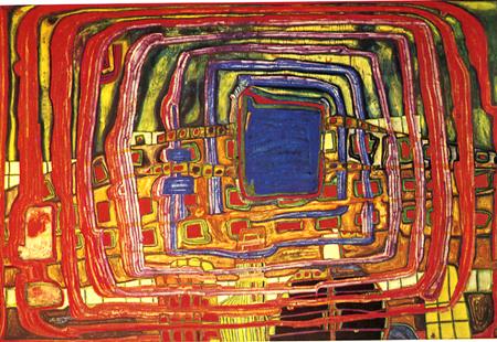
A radical change in painting occurred in the second part of the 19th century, in reaction to the stale academism of the time. The trend was first toward a more realistic depiction of every day life and of society, but gradually the painting became more abstract, a trend that terminated in a non-representative style (figs. 29-31).
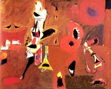
Fig. 36 (Picasso) Fig. 37 (Gorky)
Fig. 38 (Hundertwasser)
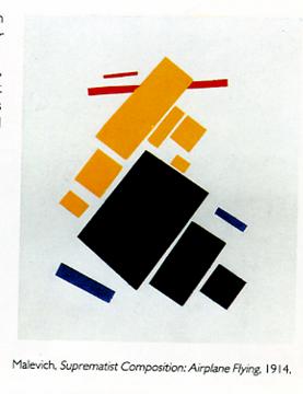
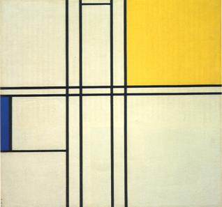
Figl 39 (Malevich) Figl 40 (Mondrian)
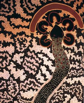
Fig. 41 (Australian aborigine) Figl 42 (Kollwitz: The Beggars)
The argument between naturalistic and highly stylized painting exists since the beginning of art, with the naturalistic cave paintings in Europe (fig.1) contrasting the abstract designs of the Australian aborigines (fig34). It still continues, and we are, of course, free to stop on the path of abstraction wherever we please. But the organization of the elements in a painting always brings along a degree of abstraction. A child drawing any object or person with his colored pencils will produce without hesitation highly stylized images of the subjects he depicts. He is unaware that the moment he draws a dark line on a light background he has left naturalistic depiction behind. Even an adult beginner may not realize that he is not just copying nature. To be an artist, he must become aware of the autonomy of the work of art. It will be useful to him to know which elements emphasize the objects in the picture, and those that de-emphasize them, pointing towards pictorial abstraction. Among the first are: roundness, strongly oriented illumination, shadows, perspective, insinuation of movement, and the story or ‘content’. Elements that emphasize the painterly aspects include suppression of light and shadow on bodies, avoidance or exaggeration of perspective, broken contours, colors bleeding out of contours or repeating conspicuously, brushstroke and knife marks, omission, repetition, rough finishing, collage, use of materials such as sand to create prominent texture, and presenting the subject, if any, in a non-objective way (e.g., cubism).
What does art say?
We are now, I hope, agreed that the esthetic values of art are related to the skill with which it transmits its message. Two portraits may depict the same person; two nativity scenes show the same arrival of the magi, but the way in which this message is delivered will determinate the value we give the work.
The beauty of a poem depends both on the depth of the idea that is expressed, and the skill with which language is used. It is, in fact, rather difficult to get enthusiastic about a poem that, using beautiful words, says ...nothing. Is the same true of painting? Why should it not, like poetic language, transmit a message external to the artistic value
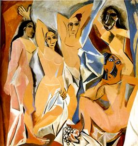
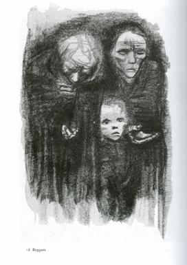
There is a contemporary school of thinking that proposes that the answer is no. For this line of thought, the formal aspects, or even the activity itself rather than the product, represent the artistic value. Applied art’ is somehow tainted by its non-esthetic aspects, and inferior to ‘art pour l’art’. This viewpoint is alien to me, and it is certainly anti-historical. We will never know why the artists in prehistoric times painted the walls of their caves. Almost the entire artistic production previous to the 20th century, however, was triggered by sponsors who were interested in a religious scene, a portrait showing their beauty or social standing, an erotic stimulant, often disguised as a scene of classic mythology, a battle scene that would please their ruler. Even music, which is by its nature more abstract than the visual acts, has its love songs and operas. The main reason I object to the exclusively formal attitude is that the rejection of the motive has often brought us meaningless triviality. I cannot help to think that the work of an artist moved by social injustice (fig. 35) is more interesting than a canvas all painted in black, or the famous urinal exhibited as an art object by Duchamp.
There is an important modern school of artists who produce paintings without a recognizable external subject (figs. 37-40).Their way of managing paint reveals their emotions, and if they are successful, they can transmit them to the observer. In the representative mode of painting as well, much of the painter’s emotive message may be related only indirectly to his ostensive subject. But ultimately this is what counts.
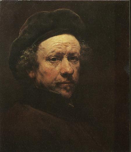
Fig. 43. (Rembrandt)
In the self-portrait, the artist reveals his feelings and moods in a way that has more impact than any words he could have written. This skill of transmitting to us emotions through space and time I believe to be the essence of art.
|
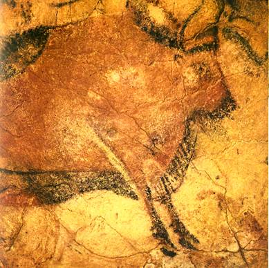

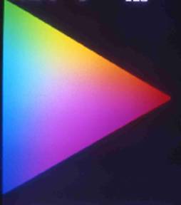
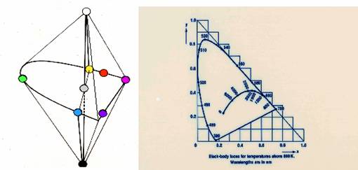

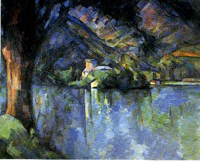
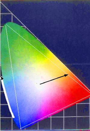
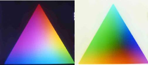
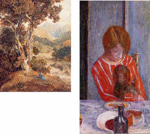
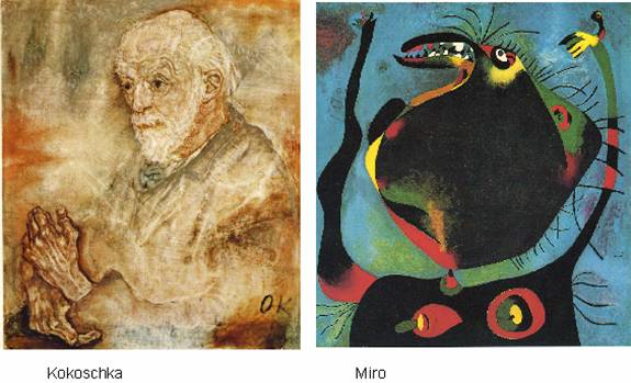
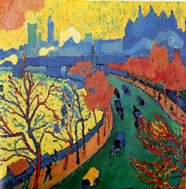 Fig. 14. (Derain)
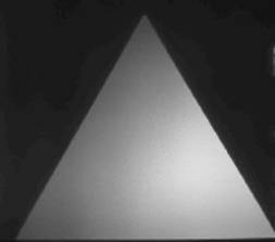
 Fig. 16 (K.H.)
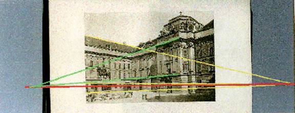
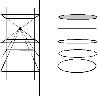
 Fig 19. (K.H.)
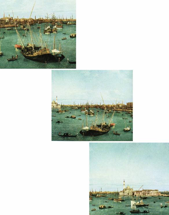

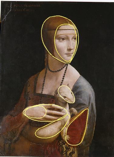
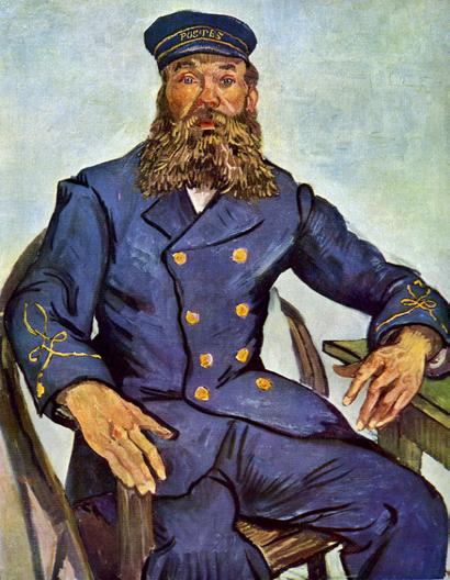 Fig.23. (Van Gogh)

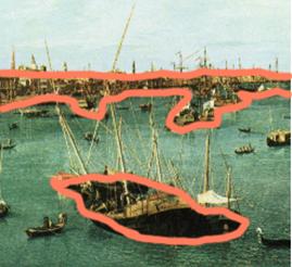

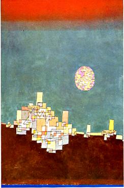
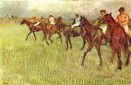
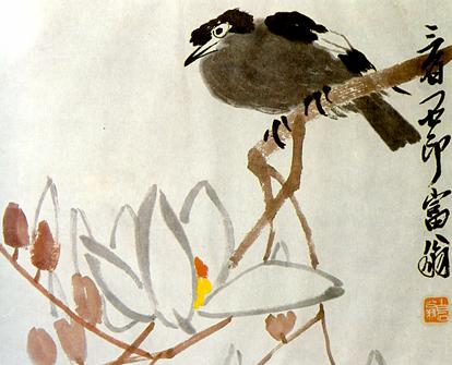

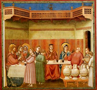 Fig. 31 (Giotto)
 Fig. 32 (KH)